
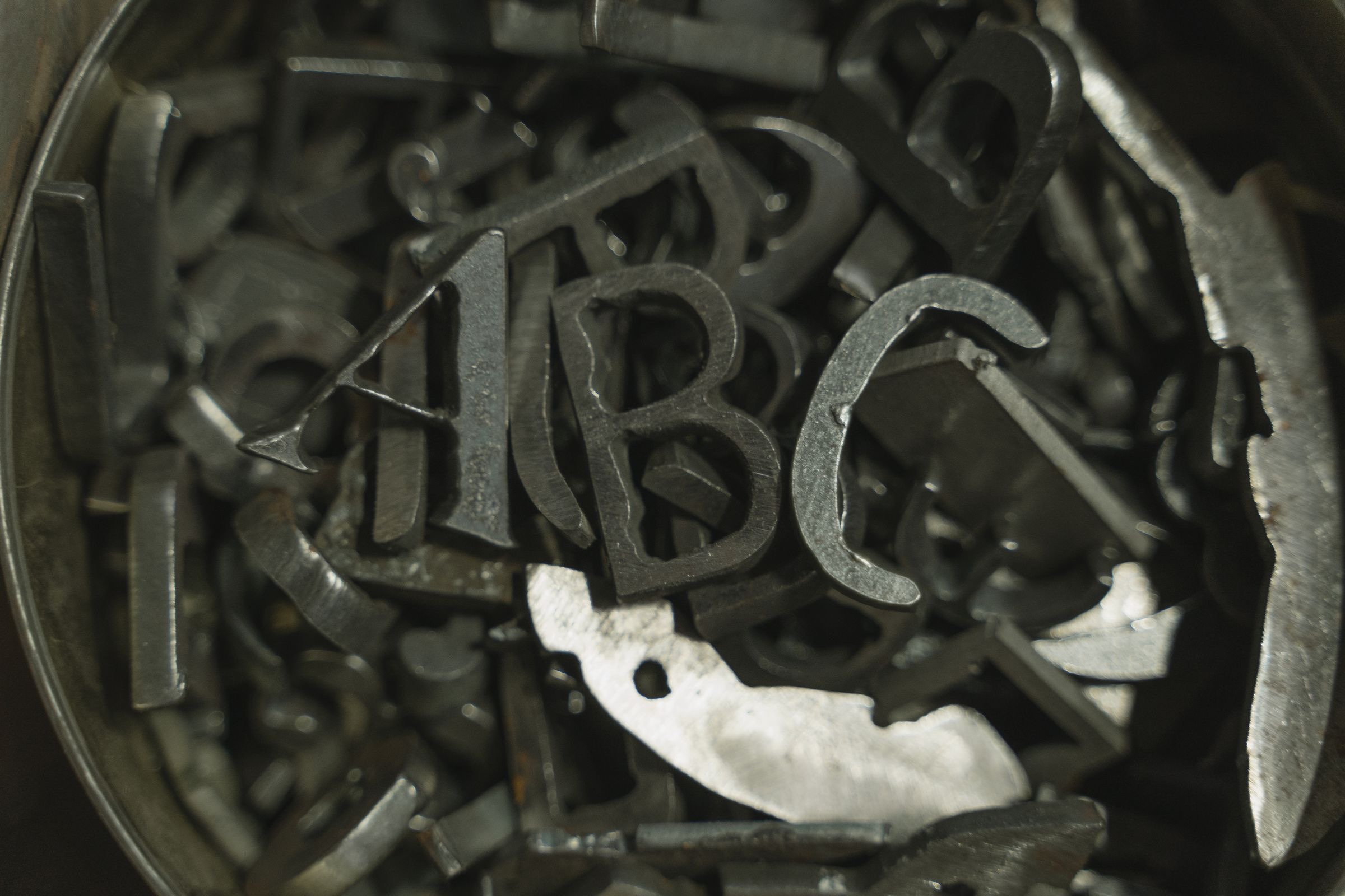
Something happened to type this year that I think most of us slept through, and I want to make a small note of it.
Variable fonts. One file that holds not a single weight but an entire range of them. A continuous axis instead of a handful of fixed stops. You are no longer choosing between regular and bold. You can choose anywhere between them, and anywhere beyond.
For twenty years the web treated typography as a menu. You picked from what you were given. Regular, bold, italic — and if you wanted a light weight and a black weight as well, that was four more files to load, so most of us didn't. The cost of caring about type quietly talked us out of caring about type.
That constraint is gone now, and I keep turning over what it means. Type can respond. A headline can get a little narrower when the screen does, instead of wrapping badly. Weight can shift with size, the way a typographer would have set it by hand in a metal shop a hundred years ago.
It's a small thing that isn't a small thing. I have loved letterforms since I spent a September designing with only nine of them, and what strikes me is that we're quietly recovering something we lost when we moved to screens. The web has spent two decades being worse at type than paper was. This feels like the first real step back.
Almost nobody is using it yet, and that doesn't bother me. The tools usually arrive before we've figured out what to do with them. I'm content to wait.