
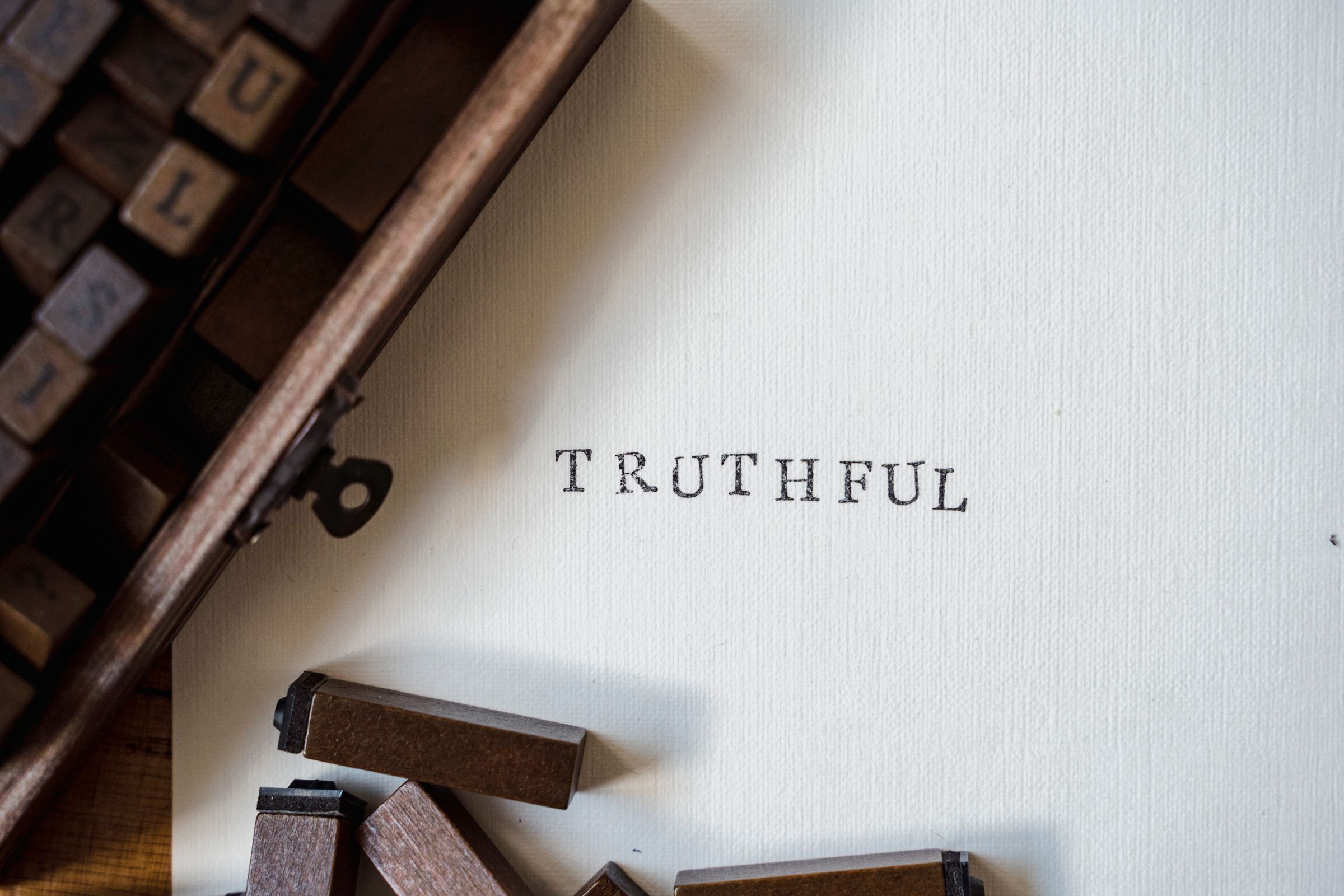
Good Day. It is the ninth month, so I set myself a small discipline this September, to design with only nine fonts for the entire month. I wanted to feel the constraint, and it taught me more in four weeks than a year of unlimited choice ever could.
The first lesson is the simplest and the most useful. No more than two fonts in a single design. I put all nine into a few pieces just to play, and they have their pros and their cons, but the constraint keeps you in a wheelhouse. You stop fretting over the unique character of a typeface and start working the things that are not limited.
With your choices narrowed, you create variety another way, through spacing and repetition, through alignment and proximity, through figure and ground, through playing with the individual letters themselves until they hold their own interest. Above all you learn to play with white space, because when the type is fixed, the room around it becomes your instrument. A constraint, used well, breaks creative block rather than causing it.
Typography matters enormously to me. I have something near six thousand fonts now, and the library never stops growing. Foundries like Linotype have been an education on their own. I love asking what makes a face read as regal rather than loud, quiet rather than outspoken, elegant rather than plain, because every one of those characteristics speaks for a brand. Pairing a brand with its true voice in type has become one of the genuine joys of my life.
The tools, I will say, have always been a frustration. There is still no good way to view a font library. You end up in Adobe Illustrator, squinting at a preview an inch wide and a quarter inch tall, trying to judge the details of one typeface among thousands. So I have built my own way around it, curating my own lists and even printing specimen sheets, so I can hold the type rather than fight the software.
What I want most, and what the web does not yet truly allow, is to put real type online. Today, to use a custom face, we still have to bake the title into an image, and that image is invisible to search, unfriendly to readers, and slow to load on a weak connection, so the headline arrives ten seconds late, if at all. The day we can set real type on the web, brand character will finally cross over into it, and a great deal of careful, intricate craft, every kern and ligature, will finally get to be seen.
Jonathan Ellis · Edmonton · September 2007